Page Layouts in Scalar 2: Media Galleries
 Structured Media Gallery. Taken from Jacqueline Wernimont et al’s Performing Archive: Curtis + “the vanishing race”.
Scalar 2 was developed in an effort to give books composed in the platform greater versatility and visual impact while also making them easier to read and navigate. To this end, we added several new page layouts options, allowing users to choose, with more precision, the look, arrangement, and in many ways, the function of individual pages within a project. In the coming weeks we’ll be blogging about those various options, which include, among others features, an image header, splash images, visualizations, and a Google Map that plots geo-reference Scalar content. Today, we’ll be talking specifically about our two media-focused layouts: the Media Gallery and the Structured Media Gallery layouts.

Our Media Gallery layout gathers all media objects inserted on a page as well as all media objects associated with the page -that is, all media object that have been tagged by the page or are in a path contained by the page- and displays them in a flip-through media carousel. Put another way, if you insert several images on page and then set that page to the Media Gallery layout, those images will appear in a carousel at the top of the page. If instead, you tag that page to several videos or make that page a path that includes a series of videos, those videos will also show up in the carousel.
The Structured Media Gallery layout functions in a similar fashion, but with a few key differences. Pages set to the Structured Media Gallery layout will display media associated with that page, not in a carousel, but as a collection of thumbnails. More importantly, it will not only gather media that are associated with the current page, but also media that are associated with its associated pages. Meaning, it will not only display media that are tagged or contained by the current page, but also media that are tagged or contained by pages that it tags or contains.
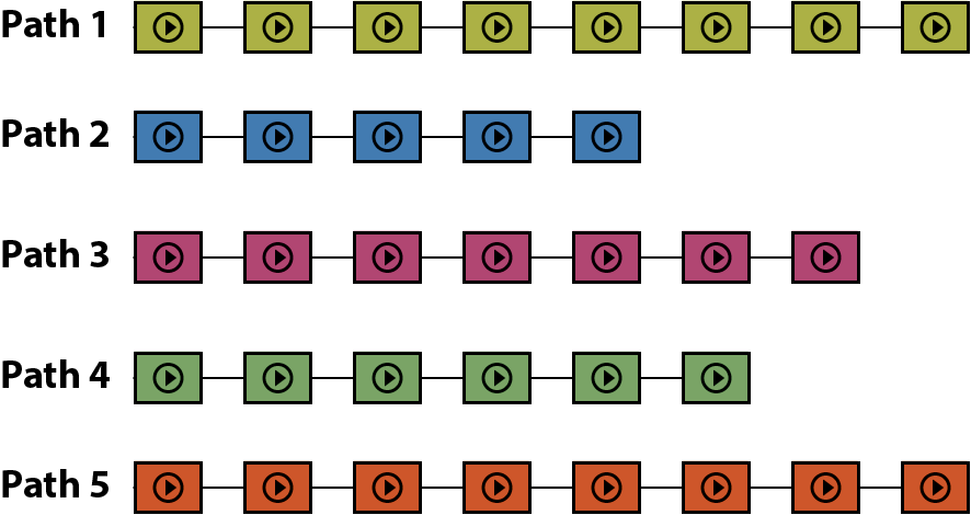
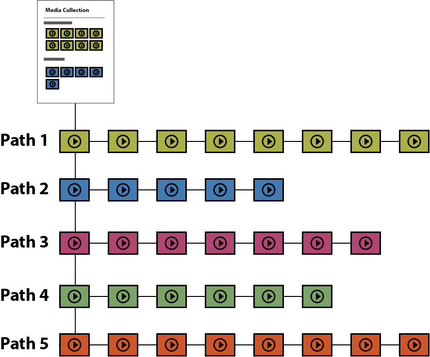
Let’s take an example. A user wants to create a collection of media used throughout their project; they want to split that collection into several mini-collections, for instance, based on themes; and they want to display the whole collection, made up of those mini-collections, all on the same page. To do this, a user would first build the mini-collections of media objects by creating paths for each –that is, creating a path for one theme, selecting the media objects that are contained in that path and then doing the same for other themes (remember, in Scalar, you can put anything on a path; not just pages, but media as well) (see figure 2). Second, they would create a top level path –say, called Media Collection- put the thematic media paths they just created on that path (again, in Scalar, you can put anything on a path, including other paths) and set that top level path to Structured Media Gallery (see figure 3). The result would be a page that displayed all of the mini-collections (paths), together, each under its respective title (see the example of the Structured Media Gallery in the header image to this article).
Pages set to the Structured Media Gallery layout will also gather and display media objects that have been tagged to the current or associated pages. So between paths and tags, there are any number of combinations one can use. Meaning, you could get the same result as above, were you to tag several paths of media objects or tag several pages that tag media objects or create a path of pages that tag media objects. The Structured Media Gallery layout will latch onto any parent to child to grandchild set of relationships in Scalar.
But, of course, one doesn’t have to use the Structured Media Gallery layout as a way to aggregate media objects two levels removed from the current page. One can also use it to gather media associated with the current page, as with the Media Gallery layout. But in this case, that media will be displayed, not in a carousel, but as thumbnails. Jason Mittell for instance, has done this to great effect, in his Complex TV, creating a thumbnail gallery of clips used across his book.

